Whether you thought the Beatles were a silly rock band for kids or a group of mature, adult songwriters might have depended on which country you grew up in.
That’s because Beatles albums, especially the early ones, were packaged and marketed in wildly different manners between England and America.
The Beatles’ album sleeves (the British ones) were historic in the way they presented pop music as a legitimate art form. And I’m not even going to mention the music itself. That would be a 10,000-word post in itself; countless others have written about their music in better ways than I ever could, so I will stick with the subject at hand.
Not enough people credit the Beatles as visual artists, and for that reason it was a shame that the American label, Capitol Records, dumbed down the band’s LP sleeves.
To really understand what made the Beatles so great, you have to consider that they had their origins in art school as much as music. They weren’t rebels with guitars – they were intellects who, before they were famous, were immersed in the world of the avant garde. Stuart Sutcliffe, the band’s original bassist, bonded with John Lennon over their love of painting. Sutcliffe was an accomplished artist (a better painter than a musician, the reason he left the band), and later became engaged to photographer Astrid Kirchherr, who captured the Beatles in numerous impressionistic photos, as well as influencing their haircuts and fashions. Then there was Kirchherr’s former boyfriend, Klaus Voormann, a bohemian artist with a classical upbringing, who became ensconced within the clique. Voormann was pitching offbeat album designs to Lennon and Sutcliffe even before the band had recorded a note.
By the time the Beatles released their first album, in 1963, there had already been an established tradition in jazz music to hire painters, designers, and photographers to create album covers that were works of art in and of themselves. In pop music, though, covers were simply products of a label’s marketing department. Record sleeves were designed to grab attention with loud photos and garish typesets.
The Beatles changed that.
As the group’s entire US catalogue has just been released on CD for the first time, there’s a legitimate concern that any commemoration of the American versions of the albums only blurs the artistry of the original UK albums – the only versions that the Beatles themselves crafted and authorized. Let’s look at the differences. (Click on any cover to view them in a gallery.)

Please Please Me: The Beatles’ first LP did not boast a particularly artful cover, being new to the business and not pushing their luck. Regardless, a theatre photographer was brought in to shoot this at the last minute, and despite the repulsive typeset and dayglo colours, the photo has a nice sense of perspective as the band looks down the stairwell of their label’s headquarters. In America, the small Vee-Jay label opted not to use the original cover, going instead for something more staid and uninspiring. A few years later, Vee-Jay re-released the collection with a cover that was more upbeat, but ultimately childish.

With The Beatles: The group's interest in visual arts prompted them to seek out Robert Freeman, a photographer renowned for his work with jazz musicians of the era. For this sleeve, the Beatles were after a cover that was artistic and visually striking. What they ended up with was progressive for its day. The label, Parlophone, initially rejected the cover on the grounds that the boys were not smiling, not to mention the lack of colour. The image went against the norms of pop-music marketing in 1963. But with this cover, the Beatles were making a bold statement – a statement that they were innovators, that pop music could be taken seriously.
At this point in time, the primary medium for rock 'n' roll was the 45 RPM single: one hit song with a throwaway tune on the B side. The Beatles were now telling audiences that when they bought a 14-song LP, they were not just getting a couple of hits plus some filler tracks, they were purchasing a work of art.
In America, though, the suits at Capitol Records were miffed by the lack of a happy, sellable cover, and tacked on blocky lettering complete with tacky colours and an exclamation mark. They also changed the name of the album from With the Beatles to Meet the Beatles! Capitol culled a few tracks and mixed in some singles so that they could create The Beatles' Second Album with the remainders.

The Capitol office in Canada also obliterated the subtlety (above). The 1963 collection was split into two albums, with the second volume, Twist and Shout, appearing with a slapdash cover created from a publicity photo and, apparently, a bottle of nail polish.

A Hard Day's Night: The UK sleeve was clever in its use of film-strip imagery, given that this was the accompanying LP for the movie of the same name. Worth noting that this was the first LP in pop-music history to be written entirely by the members of a band. Thirteen original songs: Side 1 comprising tunes from the film, with Side 2 featuring all-new, non-movie songs. In America, Side 2 was replaced by instrumental tracks, with the rest of the album and some scraps appearing on the ironically named Something New.

Beatles For Sale: Although the cover of the band’s fourth album has a zen-like beauty, some people mock this sleeve as the one with the miserable faces. Probably why Capitol opted to use publicity shots for this collection, which they again split into two records. Interesting how the Beatles had no problem presenting themselves maturely, while the marketers at Capitol clearly found that discomforting.

Help: Again with Capitol's aversion to empty space on an album cover. The blue-on-white made a nice, clean image, with the band forming semaphores to supposedly spell “Help” (though due to the semaphore for "Help" not being so graphically appealing, they tried several poses and ended up spelling NUJV). In America, the cover was cluttered up, and many songs were dropped in favour of the instrumental film score. Meanwhile, Capitol re-packaged a handful of early songs in a tacky sleeve for Early Beatles, once they acquired the rights from Vee-Jay.

Rubber Soul and Revolver: By 1965, the Beatles had enough clout to insist on their original covers being used in America. However, not enough clout to stop Capitol from altering the track list. An executive at Capitol decided that Rubber Soul should be a folk album, dropping four of the harder songs and adding two gentler ones left off Help, while Revolver had three songs pulled. Missing songs from the US versions of Help, Rubber Soul, and Revolver appeared in America on the blandly presented Yesterday And Today. (That compilation actually had a more interesting cover for its first day on the market before being pulled.) Rubber Soul's cover, with the faces slightly elongated and eyes darting into space, hints at a band somewhat dazed and mellowed (by pot, as it turns out), not an inappropriate visual for the more matured sound found inside the sleeve. Revolver is notable for having fulfilled Klaus Voormann's dream of designing a Beatles cover. What came to be known as psychedelic music was invented on Revolver, and this cover certainly heralded a new, surreal version of the Beatles.

Sgt. Pepper's Lonely Hearts Club Band: Rafts of articles have been written about this album and its cover since the record appeared in 1967, but the nutshell version: the most expensive album-cover shoot in the history of music, to accompany the most expensive album ever recorded to date. The band sought a cover that was inspired and special, to reflect the innovation put into the music itself. The sleeve was a bold work of art that became an emblem for that year's Summer of Love. But did Capitol really have to slap that ugly yellow STEREO banner across the top? Notice how that alteration forced the image to be cropped at the left side and bottom.

Magical Mystery Tour: This was the first instance of the American version of a Beatles album supplanting the official UK edition. In Britain, this soundtrack appeared as a six-song EP (pictured left), split between two 45-RPM records in one package. In America, a collection of singles was added to the package to create an 11-song LP. The cover, unfortunately, was turned into a hodge-podge.

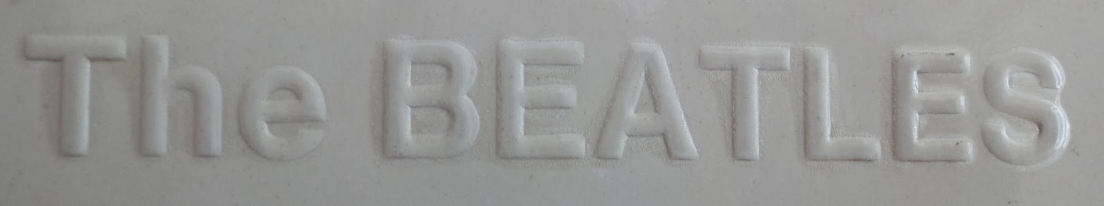
The Beatles: The White Album, as it’s unofficially called. The first pop-music double album, 30 songs running the gamut of folk, ragtime, psychedelia, country, sound collage, and some invented genres (“Helter Skelter” may have been the first heavy metal song). The sleeve was as minimalistic as could be: the band’s name was simply embossed in the corner (as shown at the top of this post), and the only ink found on the cover was a tongue-in-cheek "limited edition" serial number stamped on the first few million copies (look for it in the top-left photo, in the corner of the sleeve). The original UK pressing featured openings at the top. In America, the more standard side openings were used.

Let It Be: This one I'm throwing into the mix for fun. Let It Be appeared in the UK and the US with the same sleeve, but since we're talking about Beatles LP covers, here's a bit of historical interest: Get Back was the intended title, using the cover seen on the left. The idea was that the band was going back to its roots, throwing away all the recording techniques they pioneered, to record an album live in the studio, straight to tape, as they did with their first album. Hence the design of the cover, emulating the first record but showing how the boys changed in the ensuing seven years. Unfortunately, the record didn't turn out as planned. After the work was abandoned for about a year, 1960s producer-wunderkid Phil Spector was commissioned to finish it off (without agreement from Paul). Spector, not surprisingly, used strings, orchestras, and other overdubs to put his own touch on the record. As the "live" concept no longer applied, the title and the original sleeve were abandoned, too. Let It Be was released after Abbey Road, and after the official break-up of the band, though the bulk of it had been recorded six months before.
______________________________________________
 Abbey Road: There's no reason to include this cover in this particular article, as Abbey Road appeared the world over with the same cover. For the sake of being a completist, though, I must list it. The Beatles admitted that they knew this would be their last album, even if they never verbalized those thoughts at the time. The original plan was to title this album Everest, with the band flying to the Himalayas for a cover shot to match. Instead, having completed the arduous recording, and wanting to get the rest of their duties over with quickly, the band and their photographer marched outside the studio to complete this session in ten minutes.